

Site CSS Refactor
 So I have updated the site's CSS significantly. It has been a supremely long and exhausting process, I'm not sure I even know how to best explain it all.
I started doing this because I felt my code had become a disorganised mess. I had a lot of cases where I'd just add elements to a given set of styles, then exceptions later on, creating an intermingling of shared base rules and then re-styling. At the same time I thought I'd try my hand at reorganising it all to use nested rules, for more modern conventions, so this gave me an opportunity to give it a thorough look-over.
Things got a bit out of hand.
The main thing I was hoping out of this "refactorisation" was making the CSS smaller. I felt its disorganisation of styles resulted in bloated code.
... it did not get smaller. I think I started at about 970 lines, maybe 1100 if we include the mobile-specific adjustments. I then made a system for loading page-specific CSS to remove one-time-use styles from the main file, I combined rulesets, I made non-mobile styles wrapped in non-mobile rules rather than undoing them with mobile-specific rules, and just when it looked like I'd gone down to 800 lines, it went back up again. Currently the CSS file is split into base, common (art, blog, etc) and index styles, and sits at around 1300 lines.
Maybe this website is just inherently complex.
I don't think it's a complete loss however. If anything, the new design elements contribute to the line count going back up, and I'm pretty happy with these design changes. Additionally, things are still more organised than they once were, especially for things like the button link system.
Originally I had like three different button styles with duplicate rules everywhere. The new code establishes a central button style, a handful of variations, and I just tell a given group of links what stack of styles to apply — things like size, column count, and text-alignment. The biggest benefit to this is a more unified design language. Buttons are now consistent colours, and the vast majority of links now have animated star borders on hover.
Of course if you're using a mobile you're not going to see that. Unfortunately a lot of little details won't show up on mobile to reduce complexity and performance impact. Please view this website on a real computer for the best experience.
I still really like the wiki character buttons. I didn't change them too much... heck, I basically used them as a starting point unifying the rest of the button designs, but the raised effect and dimming of other buttons helps bring up the contrast. It's what made me really want to make use of this design elsewhere.
I would also take the design used for the social network buttons — sketchy white silhouettes — and use that for the location buttons that can be seen in the footer. (Oh, the footer's structure got an overhaul too.) It's here I started using variables a little more... vigorously so I could simply tell different buttons what slice of a single asset to use.
&::before{
	content: '';
	--sca: 1.0; --scb: 0.5;
	--base_size: 192px;
	display: block; position: relative;
	background: url("./images/white.webp") no-repeat calc(var(--x) * -1 * var(--base_size) * var(--scb)) calc(var(--y) * -1 * var(--base_size) * var(--scb)) / calc(576px * var(--sca));
	width: calc(var(--base_size) * var(--scb)); height: calc(var(--base_size) * var(--scb));
	filter: brightness(1.0);
}
A number of assets have been upsized and render at half-scale for the purpose of looking clearer on high-resolution screens. I use a Surface Pro 8 for art, and it displays everything at double resolution. This unfortunately makes a large number of websites look blurry in places unless they're using higher resolution assets or SVGs.
Handling this was a little annoying. I merged a bunch of images into a single "spritesheet" so that once something has loaded it means similar assets have also been cached. But because of making things into slices of a larger image, I had to contend with shrinking images in my pseudo-elements, which was a hassle for a while until I discovered I could just use absolute units in background-size. This is why that above code snippet is kind of like that.
I initially wanted to make some things SVGs, like hole-punches on wiki pages or even the "organiser" background on this blog, but I couldn't get a handle on getting inline SVGs to show up at all in my CSS. I gave up on trying to make an efficient organiser SVG, and found that I didn't even really need to use SVG masking for the hole-punch effect, as said holes would be consistently over a flat background anyway.
I removed the cloud/nebula blending from the header and changed the animation timing to steps, effectively reducing the animation framerate. This significantly reduces GPU impact — on my Surface with its integrated Intel graphics, it went from 50% usage while the header is on-screen to 5%.
To be honest I was never completely satisfied with the nebula-blend header. While it certainly fit my aesthetic, I also found it rather plain and partly felt stacking a few blend effects together was me trying to make up for that plainness. I'm tempted to try adding some clouds back, but I think I'll be avoiding blend effects this time.
The star mobile too was restructured internally so the code looks a little less a nightmare, while keeping the same design. The HTML was originally this monstrosity, and I always kind of hated that it was like that:
<header id="common_headersill"><header id="common_sky"></header><header id="common_header"></header><span id="common_mobile1"><img src="/images/header_star_m1.webp" class="l1" draggable="false"><img src="/images/header_star_m2.webp" class="l2" draggable="false"><img src="/images/header_star_m3.webp" class="l3" draggable="false"><img src="/images/header_star_m4.webp" class="l4" draggable="false"><img src="/images/header_star_m5.webp" class="l5" draggable="false"><img src="/images/header_star_mt.webp" class="thread t1" draggable="false"><img src="/images/header_star_mt.webp" class="thread t2" draggable="false"><img src="/images/header_star_mt.webp" class="thread t3" draggable="false"><img src="/images/header_star_mt.webp" class="thread t4" draggable="false"><img src="/images/header_star_ms.webp" class="s1" draggable="false"><img src="/images/header_star_ms.webp" class="s2" draggable="false"><img src="/images/header_star_ms.webp" class="s3" draggable="false"><img src="/images/header_star_ms.webp" class="s4" draggable="false"></span><span id="common_mobile2"><img src="/images/header_star_m6.webp" class="l6" draggable="false"><img src="/images/header_star_m7.webp" class="l7" draggable="false"><img src="/images/header_star_m8.webp" class="l8" draggable="false"><img src="/images/header_star_m9.webp" class="l9" draggable="false"><img src="/images/header_star_mt.webp" class="thread t5" draggable="false"><img src="/images/header_star_mt.webp" class="thread t6" draggable="false"><img src="/images/header_star_mt.webp" class="thread t7" draggable="false"><img src="/images/header_star_ms.webp" class="s5" draggable="false"><a href="/rss.php" title="RSS Feed" draggable="false"><img src="/images/header_star_rss.webp" class="s6" draggable="false"></a><img src="/images/header_star_ms.webp" class="s7" draggable="false"></span></header>It's so much smaller now. I came to realise the segmented images were unnecessary with how I'd designed it to collapse on smaller screens, so a lot of it has been made into singular background elements.
<header id="common_headerbase"><header id="sky"></header><header id="logo"></header><span id="mobile_l"><span><img src="/images/header_star_ms.webp"></span><span><img src="/images/header_star_ms.webp"></span><span><img src="/images/header_star_ms.webp"></span><span><img src="/images/header_star_ms.webp"></span></span><span id="mobile_r"><span><img src="/images/header_star_ms.webp"></span><span><a href="/rss.php" title="RSS Feed" draggable="false"><img src="/images/header_star_rss.webp" draggable="false"></a></span><span><img src="/images/header_star_ms.webp"></span></span></header>The last thing is less an element of refactoring and more something I always intended with Tower of Stars' design. I wanted some skeuomorphism. I wanted pages to look like paper, have some roughness and imperfections, and for the site "environment" to feel like different parts of the tower to some extent. This is something I've done before in much older designs, but I would always change my mind later because it felt overwhelming.
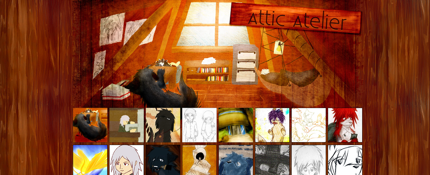
It's just kinda... loud.
The problem I had this time was I wasn't sure how to create a natural feeling to paper. Modern paper is cleanly cut and a pretty stark white. The existing texture was fine enough, but the rounded corners and shadow definitely leaned more into a web page feeling piece of paper — like there was not a complete commitment to the bit that created extra artificiality.
Like with the buttons, I made a base "paper style" which gains extra little details depending on the kind of "content". At first I just tried messing with some variables like moving around background details or specifying a different paper texture, but the former felt insufficient and the latter I either had way-too-busy textures or felt they'd break cohesion. Character profiles now look like old-style ream paper with holes along either side. This blog itself is meant to evoke a personal organiser.
This blog style was especially a nightmare as I discovered filter was breaking masking for some reason. There could've been some pseudo-element problems in there too. However working on this organiser aesthetic also is what lead me to experimenting with a lot of newer tricks. I learned about round(), which lets me avoid the ring-binder effect from slicing itself if the page height it just right, and I toyed heavily with border images to set up the leather cover.
Initially I even considered making it look like you've taken a page out of the organiser, and making the leather element a fixed size behind the paper, or that some more pages would appear on the left side of the screen, but I think I decided the suspension of disbelief was perfectly fine, and/or I was too exhausted from the work I'd already done that I never got around to it.
The front page index navigation to site locations got completely redone. I'm sure you've already seen it. The paint smear buttons were fine but kind of lazy — they also couldn't have transition effects between states due to the different states being different slices of the same image. My use of the white sketchy-style buttons had me want to try using filtered or masked artwork in places to let things fade gently between colours on hover, but I wasn't able to quite achieve this as I hoped.
I probably could mask out a colour fill with them, but I had enough trouble with SVGs as mentioned. The current method just has me using brightness filtering, as it looks close enough to the desired effect.
Along with the new front page navigation, I swapped out the plain text list in the footer for a "stairwell", to try and contribute to the tower feeling like a physical place, though not so much it's annoying as a UI. You have two locations you can move between from each section. Like all the other buttons, these use the same sketch assets and visual effects on hover.
The sketch-style buttons are also what are used for the front page navigation on mobile. I was not going to try and make that thing work on smartphones, so it simply falls back on a simpler button menu. Again, I'm sorry, but if you want the full experience of this website you're going to have to use a computer. (Or maybe most of it will show up on a tablet, if you're lucky.)
In terms of other changes, I think they're either minor aesthetic edits for consistency or entirely under the hood. Overall the biggest changes were the button/link design and paper aesthetic. As brain-wracking as it was, I am pretty happy with how this blog aesthetic looks. I got rid of the sidebar as it was rather generic, and took a stab at side-on tabs for tag sections on the blog index. (This would also inspire the "branded office paper" design for Meta page paper.)
Also thanks to the power of position: sticky; I was able to remove some minor javascript I ran on Meta pages to position the side element, though I do wish it would clamp to the top and bottom of the page. Unfortunately I had to do some negative margin shenanigans to remove empty space, which takes away that view of the top of the background element.
I really did spend way too long on this revamp despite the structure and aesthetic by and large remaining the same compared to previous design updates. I really hope people appreciate it, because we are in desperate need of a personal website renaissance — the social network landscape is on shaky ground in this current political climate. We need places we control ourselves again.